

Peter Saville for Anglo-Italian

The beauty of Punk is that one finds it at a young age. Its values have had a disproportionate impact on me, shaping my world view and staying with me into adulthood and my career. Factory Records, with its combination of spirit and design became a fixation for my teenage self — Tony Wilson and Peter Saville were guardians of an ethos, commercial and creative all at once, with a focus on authenticity, integrity and community. Whilst I can't claim to be anywhere near the heights of Factory I see marked similarities between our rationale and what drives us. So when Peter became a customer, and over time, a mentor, boyhood Jake achieved something he never thought conceivable.
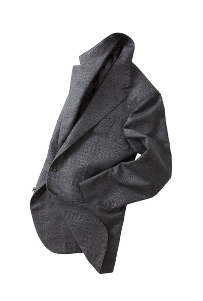
The shop has had the ability to move me in many ways, whether that be recognition of my view point, the generosity and kindness of our customers and suppliers, as well as dozens of other ways that keep our small store and the community we have fostered so close to my heart. On one of our early days in business, I was sitting on our shop's sofa late at night working on our next collection. The phone rang, I picked up, and there was Peter on the other end, who'd just driven past 57. He wished me well, exclaimed at how late it was and encouraged me to keep going. On a more recent night Peter appeared in the doorway in our Barn Jacket and an old bucket hat, leaving the driving rain to have one of our now regular discussions about design, music and business. A hero of mine wearing my clothes — I'm not sure if shop life could get any better than that.
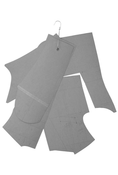
When we opened our Bespoke operation a couple of years ago, I had found our incredible cutter Caoimhe, but we needed craftspeople to put her patterns together. In short we struggled to make our garments in London, despite beautiful sewing there wasn't the handwriting which we have spent years obtaining in our jackets. So we decided to open a workshop in Italy, with makers employed and our Bespoke given the structure it needed. Small, but done for the right reasons, dedicating us to keeping the craft I love relevant, made beautifully by skilled people whose talents are under threat.
Around that time I was sat in the Bar Senza Nome in Bologna, enough cocktails deep to text Peter and let him know that I too had started a Factory, and could he possibly advise on a logo. Moments later Peter had agreed, and two years later here we are. A small nod to an era which gave me a vital framework: to do things well, to do things with integrity and to eschew the commercial in favour of something with purpose, interest and meaning.
Thank you Peter, for your time in giving this interview, our new logo, and your kind patronage of my designs and our small store.
-- Jake Grantham
How did your relationship with graphic design start?
I saw a record cover in my late teens that influenced me greatly. It was the UK version of Kraftwerk’s Autobahn. In the UK it was released with a cover simply displaying an Autobahn sign. Unwittingly, that had the most profound effect on me. European time and place was going past my mind’s eye while listening to Autobahn, and I quickly became a fan of Kraftwerk.
You know when you’re a teenager and you like something, you become quite obsessive. You find out everything by reading every interview and learning all you can. I learnt that they were classically trained musicians who were investigating the post-Stockhausen future. Because of Kraftwerk, I was ready to pick up classical records for the first time in my life. I was at a friend’s house and there was a Mozart album on the side, I was lucky it was the Clarinet Concerto in A.
What happened to me is that all of the visual and cultural landscape that played out in my mind listening to Autobahn was defined through that simple monochromatic symbol. So, Autobahn was my first brush with what I would go on to understand as ‘semiotics’ — the potency of an image to contain a broad dimension of information.
Where did your interest go from there?
In the library at art college, I discovered what you would call the canon of art and design. Basically the history of graphic design, reaching back to the beginning of the 20th century in the modernist movements, i.e. futurism, vorticism, constructivism etc. I left the library one day with a stack of books, of basically the art that I knew nothing about.
Herbert Spencer, Pioneers of Modern Typography, Mit Pr, 1983.
I sat in the refectory at college with a coffee and the books in front of me and thought, “Fuck. I’m 20 and I don’t know any of this.” That was the day my education really started – the day I wanted to learn for myself. We go through our early years learning because we have to, and if you’re lucky, there’s a moment when you want to learn for yourself.
Personally, I went on to reference the canon of art and design the way a fashion designer would: search, select, study and remodel.
Ruari McLean, Jan Tschichold: Typographer, Lund Humphries, 1975.
How has your relationship to fashion changed over the years? Perhaps you could also touch on how you combined that interest with design?
If you’ve been observing fashion for a while, as it progresses you begin to relate and then feel the particular moment. I’m not that interested in clothing, as an end in itself. I’m interested intellectually in how clothing expresses socio-cultural sentiment, a feeling of how fashion relates to the current landscape in broader brushstrokes.
It’s phenomenal that Yves Saint Laurent introduced ready-to-wear high fashion less than sixty years ago, delivering for the desires of the emerging middle class. Fashion is a litmus test of the times, a cultural indicator. Men tend to be interested in the details as they pertain to themselves. Understandably, I might be more concerned with the width of a lapel than the height of a hemline. Therefore the menswear dimension of fashion was something I was noticing in two ways: as a kind of cultural and stylistic expression of more liberal views, as well as in terms of aesthetics, thinking "what a brilliant overcoat", or "what a great pair of jeans."
When George Best appeared in Manchester, he was the first “pop star” footballer. I was in my early teens, it was a George Best moment — the iconoclastic, rebellious, bloody minded, wilful, long-haired genius. George was a symbol of pop sensibility in the mass culture of football. And what was his first venture outside of that? A clothes shop in Manchester, called Edwardia. A footballer with a boutique; menswear was really starting to happen in my early teens, and wasn’t niche anymore. I was interested since then, and followed up by reading L’Uomo Vogue, which I would find in my older brother’s bedroom.
While I was at art college in Manchester, a very fashionable shop called Manolo opened, which was a sort of regional version of Browns. I would hang out there, and I got to know the owner James Hough, who would take me to Paris on buying trips, meaning I started to see the professional side of the business. I first met Paul Smith back then. I learnt about the likes of Armani, Versace, and Browns whilst I was in Manchester. So when I got to London, I wanted to be au fait with the scene here.
Antony Price’s shop Plaza on the Kings Road in the late 70s was an astonishingly progressive place. It was really important to me because of Roxy Music, as Antony was Bryan’s stylist. The Plaza shop was fascinating. The window didn’t have any clothes, just a video screen — like something from the future. Inside, all of the product was displayed on boards, and you went to a counter like a takeaway and said ‘I want #14 in medium’. After I started going there with my girlfriend Julie, who had come down with me from Manchester, we got Antony’s attention as she looked just like Kari-Ann, the girl on the first Roxy cover.
Flesh + Blood, Roxy Music. 1980. Album Cover by Bryan Ferry, Anthony Price, Neil Kirk, Simon Puxley, Peter Saville © Roxy Music
He bought some records one day and found out I’d done the covers. From that point on, I was approved. He said Bryan was doing an album, and that’s what led to my work on Flesh and Blood. I had also met a shoe designer called Tim Slack, who had founded a company called Walkers in Bath. He and his wife Fiona had previously been doing custom platform boots for David Bowie in Glastonbury-glitter style. They had met at Clark’s in the early 70s, before setting up on their own to do bespoke boots, which was a big thing back then. But as Walkers they made classic mens shoes hip, bringing the Derby back in white nubuck with a red micro rubber sole.
Tim Slack and Antony Price were my entry into the fashion world in London; Tim got me a membership of the Zanzibar, the predecessor to the Groucho Club. He was extremely interested in art and he became, in a way, my mentor, connecting me with the broader cultural landscape. For example, he would often talk about Modernism, Marinetti and Futurism — looking back on it, Tim was such an important tutor to me.
Untitled, New Order. 1989. Tour book. Art direction Peter Saville. Design Peter Saville Associates. © Peter Saville/New Order
What was the creative process like at Factory for the record covers?
Given that it’s ‘work for others’, I had an unprecedented degree of autonomy. No one actually briefed or looked at the work. After Ian died, Joy Division continued as New Order. They were a democracy as a group — and very quickly a democracy of disagreement, as a matter of principle. If I showed them something initially in black and white, one would want green, another red, another yellow, and so on. Nobody really managed Factory and the visual identity was my responsibility. In the end, the only thing that anyone cared about was if I’d made the fucking thing. They’d say, “We made the album two months ago, where’s the cover?” If I could say it’s gone to the printers that was all they wanted to hear. For example, no one saw Blue Monday at all, it went directly from me to the printers.
Working with Jarvis Cocker for Pulp, or doing a cover for George Michael, required a consensus. With Factory, there were no gatekeepers. So I had this absolutely unprecedented opportunity to produce visual work that I felt was relevant — regardless of cost — and get it to the printers. The work was then distributed around a Joy Division or New Order record, which would go to thousands — or in the case of Blue Monday, millions — of people who already wanted to love it.
At Factory, no one knew what anything was really costing. So regarding all the rumours about Blue Monday — it did cost more than the profit margin on the release. It did lose money. Every time New Order sold a copy with its complex sleeve, Factory lost 50p — apparently.
Blue Monday, New Order, 1983. 12" Single. Peter Saville. © Peter Saville/New Order
There was an authenticity in the way that the covers were indifferent to you. They weren’t trying to sell anything. More often than not, they didn’t have the name of the group or title on them. There are now footballers who are fans, there are artists who are fans, there are van drivers who are fans. It’s populist in who it touched. It was unconcerned whether you liked it or not — and the audience felt that, consciously or subconsciously. My work was part of the project that the Factory audience respected, like the Hacienda. I had autonomy in mass production, not one picture in a gallery that a few people might see, but something with a piece of music that thousands would see.
When asked why we opened the Hacienda, Tony would say it’s a gift to the young people of Manchester — and it was. It was not a nightclub venture. It was for the young people who had supported Factory and didn’t have anywhere to go. We had Aalto stools at the bar and when it opened you could buy drinks cheaper than an off licence. Again, we weren’t trying to sell anything.
If you ask me to do a piece of work, you’re going to want to see it. If I just say, “Oh, don’t worry guys, it’s some really nice flowers.”
“Well, anything else?”
“Well, no, not really.”
You can do that with records, because people want records — and no one has not bought a record because they didn’t like the cover. You might sometimes buy a record only because you like the cover, and are then usually disappointed, but you have never not bought music you wanted because you didn’t like the cover. Therefore, the record cover is unique, in that ultimately it doesn’t matter. There’s no other form of print that actually doesn’t matter, and record covers are premium printing, and really don’t matter.
Not putting the name Joy Division on Unknown Pleasures didn’t stop it becoming one of the most famous albums of all time. When I first did a Yohji [Yamamoto] campaign without the clothes in it, the American distributors refused to support it. Basically, they said, “We don’t see the clothes, we are not paying for it.” For that collection Yohji had made pieces out of wood so you couldn’t actually wear them, and then he went on tour around Japan with an acoustic guitar. So you can see why he had said to me, “Peter, do me a campaign the way you do record covers — no clothes.” It’s quite normal now to see an advert in Vogue without the clothes. But back in 1991, you couldn’t do it without being supported by the principal decision maker, who was in that instance Yohji.
'This Was Tomorrow', Yohji Yamamoto. 1991. Peter Saville. © Yohji Yamamoto
On the theme of postmodernism, I’ve always thought the very early Factory catalogue has prime examples of postmodernism in an early form. As you mention fashion, what is your take on Duchamp’s work?
Okay, obviously, Duchamp is famous for his use of the ready-made. All of the pop artists that I knew of as a teenager, their work also employed ready-mades. They referenced the everyday and made it art. I suppose I referenced art and made it everyday. I took high culture and disseminated it, hopefully without denigrating it. To wrap the everyday with better typography and cultural references — introducing them to a new audience. I just passed it on, having found it in the library, and I gave it to them wrapped around a Joy Division or New Order record, and then they liked it.
I provided an introduction to culture for many young people. Tony Wilson would refer to pop as the “Art of the Playground”. I disliked that reading at 25, I didn’t want to be in the playground. But when I look back at it now, I realise it’s such a formative time. In the playground, there are some who are going to drive a van one day and there are some who are going to be a politician, or a doctor, or an artist — you reach them all. Because of music, they like it all. If my work had been on postcards through letter boxes, I might have only 1% of the audience I have. When it comes with music, they want to like it.
Untitled, New Order. 1989. Tour book. Art direction Peter Saville. Design Peter Saville Associates. © Peter Saville/New Order
Talk to me about Joy Division’s legacy.
Joy Division do no wrong because Joy Division don’t exist anymore. When Ian died, that was the end. He had expressed how he felt and had committed the greatest act of authenticity that an artist can create, giving ultimate meaning to their work. He wrote ‘love will tear us apart’ — and meant it.
Of course, what we seek in life and culture is authenticity. It’s that need for authenticity that has let us down again and again through our politicians, writers, public figures, actors, authors, musicians and movie stars. Ian Curtis has never let us down, hence the ongoing mythology in the canon of pop culture.
I recently saw a Zara T-shirt with Unknown Pleasures on it.
That’s an interwoven story of the legacy of Joy Division, but also the strange phenomenon of the Unknown Pleasures image. Many, many people buy that T-shirt and have no idea what it is. They’ve never heard of Joy Division. Even if they have, they might not have heard the music and don’t realise that image is connected to it. Obviously, some do and it’s an almost sacred relic.
Unknown Pleasures, Joy Division, 1979. Peter Saville. © Peter Saville/Joy Division.
Is that the apotheosis of what you always dreamt of? The wrapping of beauty into mass-produced culture.
Totally. What appeals to me is the holistic experience of art and life. For so many of us, art has now become things, a consumer product.
Do you remember the scene in American Psycho when the guys in a boardroom in New York are comparing business cards? That is such a post-Factory moment — the awareness of typography. When I went to art college we hated it, there was nothing more boring than typography. Malcolm Garrett, Neville Brody and I reintroduced type as a quintessential styling element.
In my opinion, everyone needs to be a stylist now. Architects, fashion designers, artists and designers. That’s the era in which we live. We are all aware of what things mean. You don’t have a menswear shop because men need clothing. It’s more complicated than that. It’s a statement, everything we do is a statement. ■
Interview conducted by Jake Grantham at Peter Saville Studio, 2023.
With thanks to:
Peter Saville
Credits:
Art Direction: Katie Hession
Photography: Celia Spenard-Ko
Research: Tom Skipp
Editor: Max Copeman